Google Ngram Viewer in the ESL Classroom
When answering students’ questions about what people usually say or which word is more common, I generally follow my instincts. It pays to be familiar with various types of English and to hedge when you’re not certain:
I think most people say..
I’ve heard it said both ways.
That sounds like the more common word.
An illustrative tool that I occasionally turn to in these situations is Google Ngram Viewer. It’s a search engine that charts the frequency of words appearing in books over time. It doesn’t measure spoken words or recent slang, but it shows broad trends in language use.
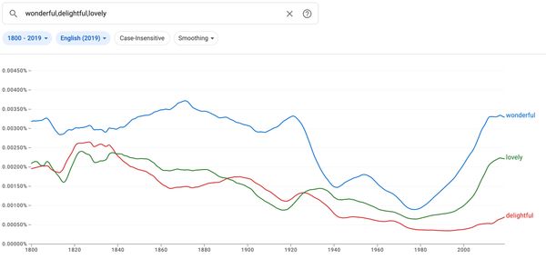
For example, a student is introduced to a word like delightful, and then they question how often it is used. By bringing up the following graph, they can see it appears roughly a fifth as often as wonderful and a third as often as lovely.

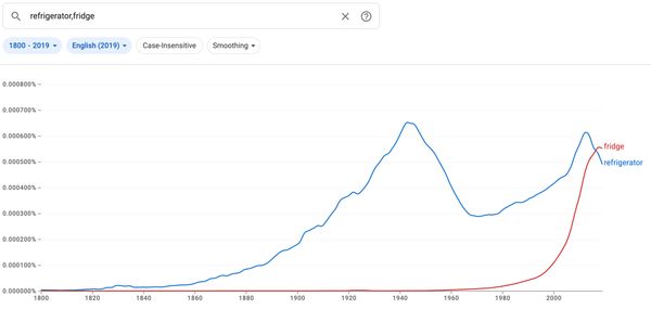
For a different example, a student is struggling to pronounce refrigerator. I tell them that it’ll get easier to say with practice, and also that it’s fine to say fridge. Fridge is easier to say and probably more common in speech. Even in print, it appears to have taken over:

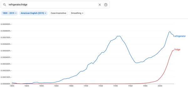
That graph pools together different versions of English. If you want to focus on, say, American sources only, that’s also possible. While fridge doesn’t appear as often as refrigerator in American English, usage of the two appears to be converging:

As I said before, I only turn to this tool occasionally, but it’s always clear that students find the visualization interesting.